تعرف على كيفية تنسيق الصور باستخدام CSS.
صور مستديرة
استخدم الخاصية border-radius لإنشاء صور مستديرة:
img {
  border-radius: 8px;
}
img {
  border-radius: 50%;
}
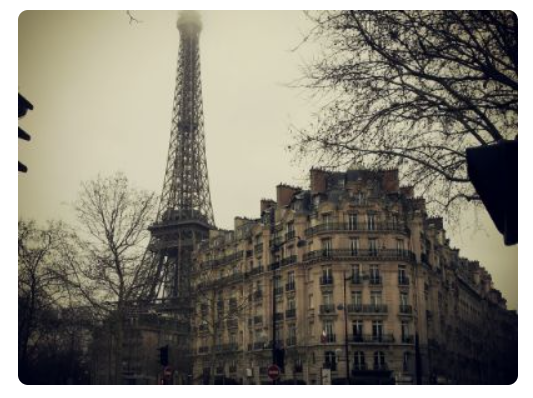
صور مصغرة
يمكن استخدام الخاصية border لإنشاء صور مصغرة.
صورة مصغرة:
img {
border: 1px solid #ddd;
border-radius: 4px;
padding: 5px;
width: 150px;
}
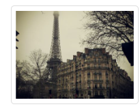
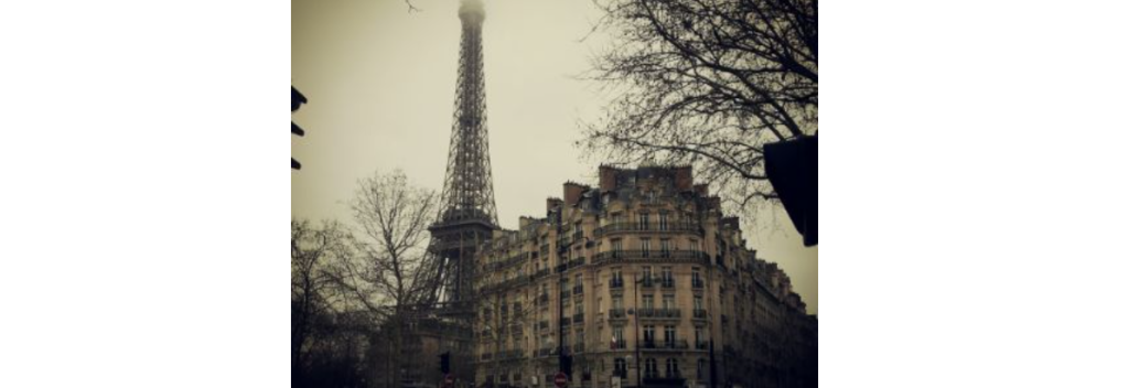
<img src="paris.jpg" alt="Paris">
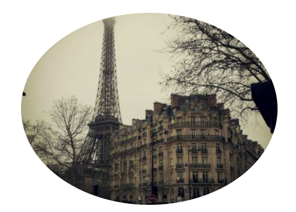
الصورة المصغرة كرابط:
img {
  border: 1px solid #ddd;
  border-radius: 4px;
  padding: 5px;
  width: 150px;
}

img:hover {
  box-shadow: 0 0 2px 1px rgba(0, 140, 186, 0.5);
}

<a href="paris.jpg">
  <img src="paris.jpg" alt="Paris">
</a>
صور استجابة (Responsive Images)
تتكيف الصور الاستجابة تلقائيًا لتناسب حجم الشاشة.
إذا كنت تريد تصغير حجم الصورة إذا لزم الأمر، ولكن لا يتم تكبيرها أبدًا لتصبح أكبر من حجمها الأصلي، أضف ما يلي:
img {
  max-width: 100%;
  height: auto;
}
مركز الصورة
لجعل الصورة في المنتصف، قم بتعيين الهامش الأيسر والأيمن إلى auto وتحويلها إلى عنصر block:
img {
  display: block;
  margin-left: auto;
  margin-right: auto;
  width: 50%;
}
صور بولارويد / بطاقات
div.polaroid {
  width: 80%;
  background-color: white;
  box-shadow: 0 4px 8px 0 rgba(0, 0, 0, 0.2), 0 6px 20px 0 rgba(0, 0, 0, 0.19);
}

img {width: 100%}

div.container {
  text-align: center;
  padding: 10px 20px;
}
صور شفافة
يمكن للخاصية opacity أن تأخذ قيمة من 0.0 – 1.0. كلما انخفضت القيمة، زاد الشفافية:
opacity: 0.0;– صورة شفافة تمامًا (غير مرئية)opacity: 1.0;– صورة غير شفافة تمامًا (معتمة)
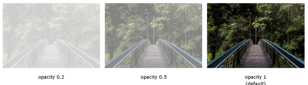
img {
  opacity: 0.5;
}
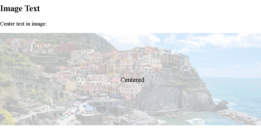
نص الصورة
\كيفية وضع النص في الصورة:
<!DOCTYPE html>
<html>
<head>
<style>
.container {
position: relative;
}
.center {
position: absolute;
top: 50%;
left: 50%;
transform: translate(-50%, -50%);
font-size: 18px;
}
img {
width: 100%;
height: auto;
opacity: 0.3;
}
</style>
</head>
<body>
<h2>Image Text</h2>
<p>Center text in image:</p>
<div class="container">
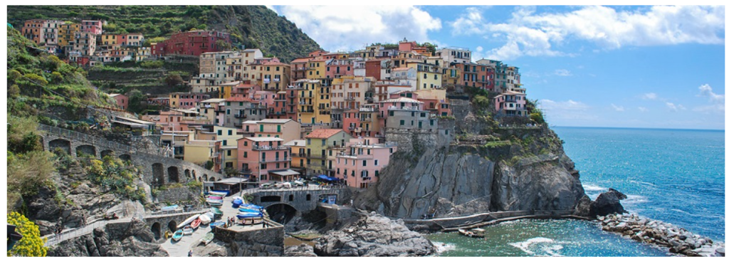
<img src="img_5terre_wide.jpg" alt="Cinque Terre" width="1000" height="300">
<div class="center">Centered</div>
</div>
</body>
</html>مرشحات الصور (Image Filters)
تضيف خاصية CSS filter تأثيرات بصرية (مثل التمويه والإشباع) إلى عنصر.
ملاحظة: لا يُدعم استخدام خاصية filter في متصفحات Internet Explorer أو Edge 12.
مثال
تحويل لون جميع الصور إلى أبيض وأسود (رمادي 100٪):
img {
  filter: grayscale(100%);
}
<!DOCTYPE html>
<html>
<head>
<style>
body {
  background-color:white;
}
img {
  width: 33%;
  height: auto;
  float: left;
  max-width: 235px;
}

.blur {filter: blur(4px);}
.brightness {filter: brightness(250%);}
.contrast {filter: contrast(180%);}
.grayscale {filter: grayscale(100%);}
.huerotate {filter: hue-rotate(180deg);}
.invert {filter: invert(100%);}
.opacity {filter: opacity(50%);}
.saturate {filter: saturate(7);}
.sepia {filter: sepia(100%);}
.shadow {filter: drop-shadow(8px 8px 10px green);}
</style>
</head>
<body>

<h2>Image Filters</h2>

<p><strong>Note:</strong> The filter property is not supported in Internet Explorer or Edge 12.</p>

<img src="pineapple.jpg" alt="Pineapple" width="300" height="300">
<img class="blur" src="pineapple.jpg" alt="Pineapple" width="300" height="300">
<img class="brightness" src="pineapple.jpg" alt="Pineapple" width="300" height="300">
<img class="contrast" src="pineapple.jpg" alt="Pineapple" width="300" height="300">
<img class="grayscale" src="pineapple.jpg" alt="Pineapple" width="300" height="300">
<img class="huerotate" src="pineapple.jpg" alt="Pineapple" width="300" height="300">
<img class="invert" src="pineapple.jpg" alt="Pineapple" width="300" height="300">
<img class="opacity" src="pineapple.jpg" alt="Pineapple" width="300" height="300">
<img class="saturate" src="pineapple.jpg" alt="Pineapple" width="300" height="300">
<img class="sepia" src="pineapple.jpg" alt="Pineapple" width="300" height="300">
<img class="shadow" src="pineapple.jpg" alt="Pineapple" width="300" height="300">

</body>
</html>
تأثيرات تحويم صور (Image Hover Overlay)
إنشاء تأثير تراكب عند تحريك الماوس فوق الصورة:
أمثلة
Fade in Overlay
<!DOCTYPE html>
<html>
<head>
<style>
.container {
  position: relative;
  width: 50%;
}

.image {
  display: block;
  width: 100%;
  height: auto;
}

.overlay {
  position: absolute;
  top: 0;
  bottom: 0;
  left: 0;
  right: 0;
  height: 100%;
  width: 100%;
  opacity: 0;
  transition: .5s ease;
  background-color: #008CBA;
}

.container:hover .overlay {
  opacity: 1;
}

.text {
  color: white;
  font-size: 20px;
  position: absolute;
  top: 50%;
  left: 50%;
  transform: translate(-50%, -50%);
  -ms-transform: translate(-50%, -50%);
}
</style>
</head>
<body>

<h2>Fade in Overlay</h2>

<div class="container">
  <img src="img_avatar.png" alt="Avatar" class="image">
  <div class="overlay">
    <div class="text">Hello World</div>
  </div>
</div>

</body>
Fade in a Box
<!DOCTYPE html>
<html>
<head>
<style>
.container {
  position: relative;
  width: 50%;
}

.image {
  opacity: 1;
  display: block;
  width: 100%;
  height: auto;
  transition: .5s ease;
  backface-visibility: hidden;
}

.middle {
  transition: .5s ease;
  opacity: 0;
  position: absolute;
  top: 50%;
  left: 50%;
  transform: translate(-50%, -50%);
  -ms-transform: translate(-50%, -50%)
}

.container:hover .image {
  opacity: 0.3;
}

.container:hover .middle {
  opacity: 1;
}

.text {
  background-color: #4CAF50;
  color: white;
  font-size: 16px;
  padding: 16px 32px;
}
</style>
</head>
<body>

<h2>Fade in a Box</h2>

<div class="container">
  <img src="img_avatar.png" alt="Avatar" class="image" style="width:100%">
  <div class="middle">
    <div class="text">John Doe</div>
  </div>
</div>

</body>
</html>
Slide in Overlay from the Top
<!DOCTYPE html>
<html>
<head>
<style>
.container {
  position: relative;
  width: 50%;
}

.image {
  display: block;
  width: 100%;
  height: auto;
}

.overlay {
  position: absolute;
  bottom: 100%;
  left: 0;
  right: 0;
  background-color: #008CBA;
  overflow: hidden;
  width: 100%;
  height: 0;
  transition: .5s ease;
}

.container:hover .overlay {
  bottom: 0;
  height: 100%;
}

.text {
  white-space: nowrap;
  color: white;
  font-size: 20px;
  position: absolute;
  overflow: hidden;
  top: 50%;
  left: 50%;
  transform: translate(-50%, -50%);
  -ms-transform: translate(-50%, -50%);
}
</style>
</head>
<body>

<h2>Slide in Overlay from the Top</h2>

<div class="container">
  <img src="img_avatar.png" alt="Avatar" class="image">
  <div class="overlay">
    <div class="text">Hello World</div>
  </div>
</div>

</body>
</html>
Slide in Overlay from the Bottom
<!DOCTYPE html>
<html>
<head>
<style>
.container {
  position: relative;
  width: 50%;
}

.image {
  display: block;
  width: 100%;
  height: auto;
}

.overlay {
  position: absolute;
  bottom: 0;
  left: 0;
  right: 0;
  background-color: #008CBA;
  overflow: hidden;
  width: 100%;
  height: 0;
  transition: .5s ease;
}

.container:hover .overlay {
  height: 100%;
}

.text {
  white-space: nowrap;
  color: white;
  font-size: 20px;
  position: absolute;
  overflow: hidden;
  top: 50%;
  left: 50%;
  transform: translate(-50%, -50%);
  -ms-transform: translate(-50%, -50%);
}
</style>
</head>
<body>

<h2>Slide in Overlay from the Bottom</h2>

<div class="container">
  <img src="img_avatar.png" alt="Avatar" class="image">
  <div class="overlay">
    <div class="text">Hello World</div>
  </div>
</div>

</body>
</html>
Slide in Overlay from the Left
<!DOCTYPE html>
<html>
<head>
<style>
.container {
  position: relative;
  width: 50%;
}

.image {
  display: block;
  width: 100%;
  height: auto;
}

.overlay {
  position: absolute;
  bottom: 0;
  left: 0;
  right: 0;
  background-color: #008CBA;
  overflow: hidden;
  width: 0;
  height: 100%;
  transition: .5s ease;
}

.container:hover .overlay {
  width: 100%;
}

.text {
  white-space: nowrap;
  color: white;
  font-size: 20px;
  position: absolute;
  overflow: hidden;
  top: 50%;
  left: 50%;
  transform: translate(-50%, -50%);
  -ms-transform: translate(-50%, -50%);
}
</style>
</head>
<body>

<h2>Slide in Overlay from the Left</h2>

<div class="container">
  <img src="img_avatar.png" alt="Avatar" class="image">
  <div class="overlay">
    <div class="text">Hello World</div>
  </div>
</div>

</body>
</html>
Slide in Overlay from the Right
html>
<html>
<head>
<style>
.container {
  position: relative;
  width: 50%;
}

.image {
  display: block;
  width: 100%;
  height: auto;
}

.overlay {
  position: absolute;
  bottom: 0;
  left: 100%;
  right: 0;
  background-color: #008CBA;
  overflow: hidden;
  width: 0;
  height: 100%;
  transition: .5s ease;
}

.container:hover .overlay {
  width: 100%;
  left: 0;
}

.text {
  white-space: nowrap;
  color: white;
  font-size: 20px;
  position: absolute;
  overflow: hidden;
  top: 50%;
  left: 50%;
  transform: translate(-50%, -50%);
  -ms-transform: translate(-50%, -50%);
}
</style>
</head>
<body>

<h2>Slide in Overlay from the Right</h2>

<div class="container">
  <img src="img_avatar.png" alt="Avatar" class="image">
  <div class="overlay">
    <div class="text">Hello World</div>
  </div>
</div>

</body>
</html>
اقلب الصورة
img:hover {
  transform: scaleX(-1);
}
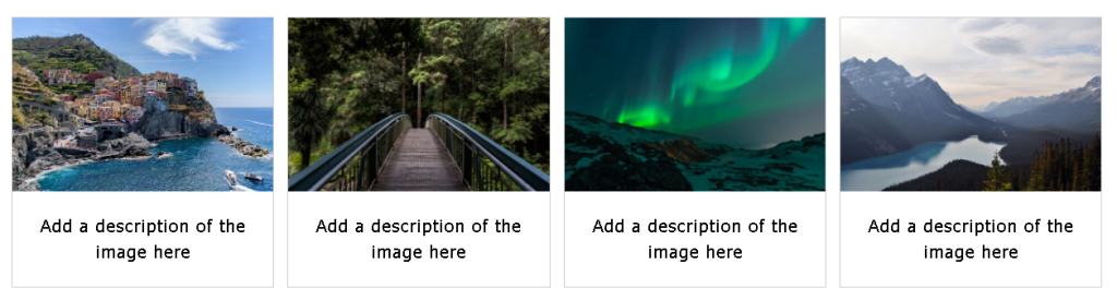
معرض الصور المستجيبة
يمكن استخدام CSS لإنشاء معارض الصور. يستخدم هذا المثال استعلامات الوسائط لإعادة ترتيب الصور على أحجام مختلفة للشاشة. قم بتغيير حجم نافذة المتصفح لرؤية التأثير:
.responsive {
  padding: 0 6px;
  float: left;
  width: 24.99999%;
}

@media only screen and (max-width: 700px){
  .responsive {
    width: 49.99999%;
    margin: 6px 0;
  }
}

@media only screen and (max-width: 500px){
  .responsive {
    width: 100%;
  }
}
النافذة المنبثقة للصور (Image Modal – Advanced)
هذا مثال يوضح كيفية عمل CSS و JavaScript معًا.
بدايةً، استخدم CSS لإنشاء نافذة منبثقة (مربع حوار)، وأخفيها بشكل افتراضي.
بعد ذلك، استخدم JavaScript لإظهار النافذة المنبثقة وعرض الصورة داخل النافذة، عندما يضغط المستخدم على الصورة.
<!DOCTYPE html>
<html>
<head>
<style>
#myImg {
border-radius: 5px;
cursor: pointer;
transition: 0.3s;
}
#myImg:hover {opacity: 0.7;}
/* The Modal (background) */
.modal {
display: none; /* Hidden by default */
position: fixed; /* Stay in place */
z-index: 1; /* Sit on top */
padding-top: 100px; /* Location of the box */
left: 0;
top: 0;
width: 100%; /* Full width */
height: 100%; /* Full height */
overflow: auto; /* Enable scroll if needed */
background-color: rgb(0,0,0); /* Fallback color */
background-color: rgba(0,0,0,0.9); /* Black w/ opacity */
}
/* Modal Content (image) */
.modal-content {
margin: auto;
display: block;
width: 80%;
max-width: 700px;
}
/* Caption of Modal Image */
#caption {
margin: auto;
display: block;
width: 80%;
max-width: 700px;
text-align: center;
color: #ccc;
padding: 10px 0;
height: 150px;
}
/* Add Animation */
.modal-content, #caption {
animation-name: zoom;
animation-duration: 0.6s;
}
@keyframes zoom {
from {transform: scale(0.1)}
to {transform: scale(1)}
}
/* The Close Button */
.close {
position: absolute;
top: 15px;
right: 35px;
color: #f1f1f1;
font-size: 40px;
font-weight: bold;
transition: 0.3s;
}
.close:hover,
.close:focus {
color: #bbb;
text-decoration: none;
cursor: pointer;
}
/* 100% Image Width on Smaller Screens */
@media only screen and (max-width: 700px){
.modal-content {
width: 100%;
}
}
</style>
</head>
<body>
<h2>Image Modal</h2>
<p>Here, we use CSS to create a modal (dialog box) that is hidden by default.</p>
<p>We use JavaScript to trigger the modal and to display the current image inside the modal when it is clicked on. Also note that we use the value from the image's "alt" attribute as an image caption text inside the modal.</p>
<p>Don't worry if you do not understand the code right away. When you are done with CSS, go to our JavaScript Tutorial to learn more.</p>
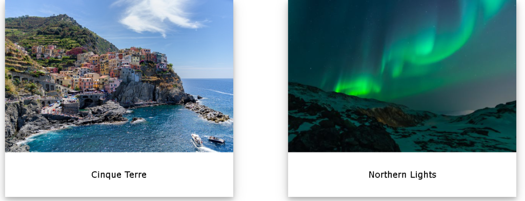
<img id="myImg" src="img_lights.jpg" alt="Northern Lights, Norway" width="300" height="200">
<!-- The Modal -->
<div id="myModal" class="modal">
<span class="close">×</span>
<img class="modal-content" id="img01">
<div id="caption"></div>
</div>
<script>
// Get the modal
var modal = document.getElementById('myModal');
// Get the image and insert it inside the modal - use its "alt" text as a caption
var img = document.getElementById('myImg');
var modalImg = document.getElementById("img01");
var captionText = document.getElementById("caption");
img.onclick = function(){
modal.style.display = "block";
modalImg.src = this.src;
captionText.innerHTML = this.alt;
}
// Get the <span> element that closes the modal
var span = document.getElementsByClassName("close")[0];
// When the user clicks on <span> (x), close the modal
span.onclick = function() {
modal.style.display = "none";
}
</script>
</body>
</html>